WIP: N.Kristine Photography Logo Process
Just after Thanksgiving I was able to finalize a logo for one of my lovely clients. You have seen her mood board and initial logo options in past posts, but I thought I would create one large post that details my process creating the final logo.
My client Nicole, of N.Kristine Photography, is such a sweetheart and a kick ass young mom. Nicole works mostly as a wedding photographer, but also does portraits and her own beautiful fine art photography. Drawing inspiration from her Michigan surroundings - she loves natural textures, wildflowers, and a woodsy romantic feel. She loves logos that are untraditional in shape and was attracted to my hand-drawn style. Her core values for her brand are truth, harmony, love, art and adventure - ideals I can really get behind! She also has a young daughter who has been going through a rough time dealing with a chronic illness - and it was important to Nicole to have something that reminds her of her daughter reflected in the logo somehow.
First I always start with a shared Pinterest board with my client. Nicole was an excellent pinner and had incredibly imagery to draw from for her mood board. For the mood board I set out to capture that woodsy/organic/romantic feel.

Nicole loved the moodboard right away and so it was easy to move on to the next stage. After about 10 days of sketching away, I presented Nicole with a large set of logos for her first round.
For these logos I was inspired by many things - but especially compasses and her love for wildflowers. I loved the idea of the "N" looking like "North" in a compass - signifying that Nicole will be a stable guide to your wedding day.
LOGO ROUND 1

Nicole was very happy with the first round of logos and had some ideas as we went into the second round. She was concerned that the flowers would attract too girly of a clientele, and thought leaves may be a better fit. I agreed and so worked to bring leaves into many of the logo options. For the leaves I went with an olive branch style as it is a symbol of peace - which felt right for Nicole's brand. I also always included at least two branches to represent mother and daughter entwined together (in the second to last it is mother, father, and daughter together). For this second round I also got out my paint brushes and showed Nicole both a painted version and 'clean' version of the logo options.
LOGO ROUND 2

As always in the second round I mocked up all of the logo options on a website template - in order to give context to the logos. Below is a sampling of the templates I created.

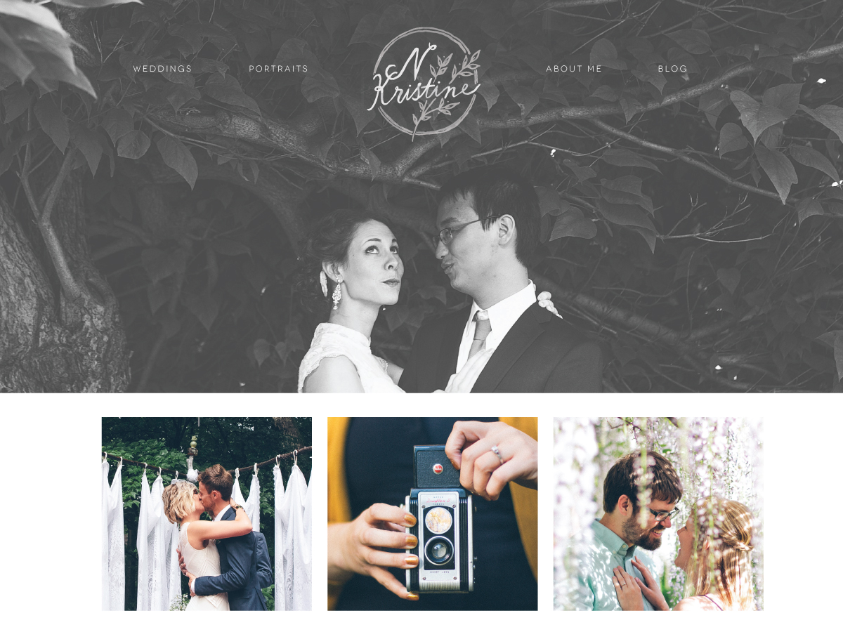

After the second round, Nicole was clear on which options she preferred. In her feedback she noted that she really liked the tall hand-written font of the compass, but felt the compass may be too much. So I created an option that excluded the compass triangles, creating a more simplified but lovely mark.
Logo Round 3

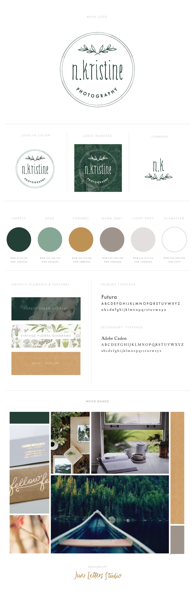
She loved that last one, but had one last request to see an option with a lowercase font. I agreed that was a great idea - and the final logo was born! This final logo includes so many of the elements she desired at the beginning of this process. The circle is a unique shape, the feel is hand-made and organic, the logo includes the intertwined olive branches that represent her relationship with her daughter - but also have a woodsy feel.
Final Logo

After the logo was finalized I built out the brand to include a minimal mark, colors, graphic elements, and fonts. I am really loving this direction and looking forward to building out the rest of her brand and getting started on her website.
Hope you enjoyed this little re-cap of my logo process. I will continue to update with our progress :) If you are interested in working together to design your dream brand - please do get in touch!