Work in Progress: Jingling Gate
Hello! Recently I have been working hard on the branding for a very wonderful client, Emma, of Jingling Gate. We worked together at Threadflip, and I am so happy that she thought of me to brand her new web-development business (with an all female staff of engineers!). She is a super smart lady and I know her business is going to be very successful. Today I am going to share a bit of a peek into my branding process with a client.
I owe most of my process to the lovely Breanna Rose, she has spoken often of her process with branding clients on her blog, and I have taken a lot of her suggestions and integrated it into my own workflow. As per her suggestion, I first have most clients start with taking a branding questionnaire - which helps me get into the headspace of the client. But it also helps the client to think deeply about their goals for their business. It really helps for us to get on the same page.
Then I create a Pinterest board for my client and start pinning inspiration, if the client is Pinterest-friendly, then I ask them to join and pin as well! From there I will create a moodboard that I hope sums up the general direction/feel of the brand. I then like to meet up (or skype) with my clients to get their feedback on the moodboard and general branding direction.
Since Emma's company is female staffed (which is unusual for a Silicon Valley web development team) she wanted the feel of the brand to be feminine and different than what is out there in the engineering/start-up space in order to stand out from the crowd. I started with this moodboard below:

My first moodboard for Jingling Gate
When I met with Emma and went over the inspiration, we decided that loopy scripts, flowers, and pastel colors weren't for her. But she did like the general feel of the inspiration. Which gave me great guidance as I headed into the logo designing process.
Sometimes I will go back and revise the moodboard, but with Emma, I had a pretty good sense of the direction that she wanted to go so I started sketching. The name of her company is a bit unusual - it is the name of a Pub in England that her dad used to love. For some reason when I heard Jingling Gate, I kept thinking about an old fashioned key. Maybe because keys jingle? Not sure - but I knew I was on to something. I started sketching lots of ideas on paper, and then began bringing some of them to life through illustrator.

My initial "sketches" are always a bit rough but clearly illustrate an idea or direction. I always like to include some "wildcard" ideas just to really get a sense of the clients likes and dislikes. Since the logo is for a team of engineers I wanted to bring in some sort of reference to coding. The </> is the most iconic symbol for coding, so I thought long and hard on how I could bring that in to the design. It then dawned on me that I could place it within the key - and it would still look like an old skeleton key. I was pretty excited about this direction :)
Luckily so was Emma! After I presented these ideas to Emma it was clear that the key and simple serif type was the way to go. So I worked on a few more iterations of the key, and also mocked them up as a website to give the logos context:


Emma and team really liked the key from #3 and the type from #4 so it was very easy to combine the two into the final logo. They also liked the orientation from #1, and thought it would be great as an alternate style when you need a more horizontal logo.
Once the final logo was decided on, I got to work building out the brand:
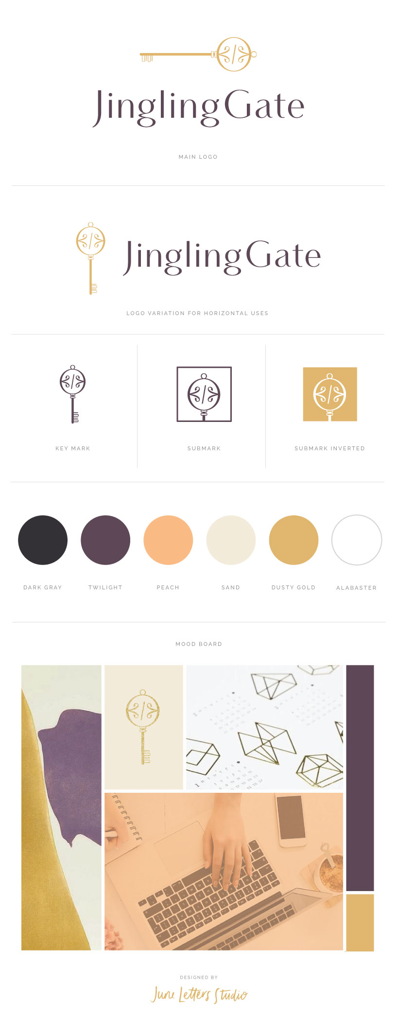
I am really happy with how the branding turned out. We are now working together to design the website - so I will update once that is done! Emma and team have been great clients, super easy going and appreciative of my work! A happy client is a very happy Jess :)
Are you looking to brand your own awesome business? Please do get in touch, I would love to work together!